How to Match Colors in an Outfit (Reusable Method)
The fastest reliable way to match colors in an outfit is to build on one or two neutrals and add a single color you like. That one move, a neutral base plus one color, handles most of what you will ever wear. From there, four color-wheel choices cover almost everything else: keep it monochrome (one color, many shades), go analogous (colors that sit next to each other), go complementary (colors opposite each other for contrast), or stay with neutral-plus-accent. You do not need to memorize a color wheel to get dressed. You need one formula and a short list of pairings you trust, and this guide gives you both.
Below, each method is tied to clothes you probably already own, so you finish knowing what to actually wear, not just what “complementary” means. There is a cheat-sheet table near the end you can bookmark, and an honest section on the color rules you can safely ignore.
The one formula that always works: neutrals do the heavy lifting

Here is the single most useful thing to know about color: neutrals go with almost everything, so they do most of the work in a good outfit. The classic neutrals are black, white, gray, navy, beige, tan, brown, and cream. Denim behaves like a neutral too. Because neutrals do not compete with color, an outfit built on them is very hard to get wrong.
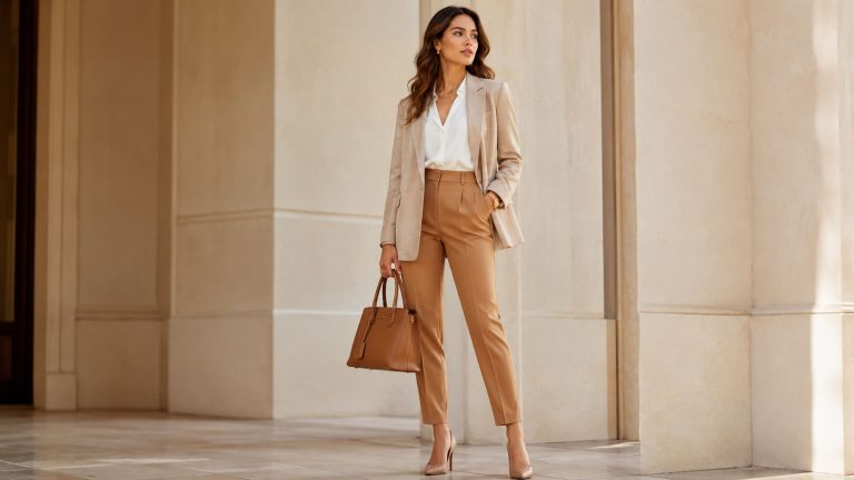
So the base formula is simple: one or two neutrals plus one color. A camel coat, white tee, and blue jeans is two neutrals plus a soft color. Black trousers, a gray knit, and a red bag is two neutrals plus one accent. When you are unsure, retreat to this. It reads as intentional every time, and it is the reason a person can own very few pieces and still look put together.
If you take only one idea from this article, take this one. Everything after it is a way to add a second or third color on purpose once the neutral base feels easy.

The four color-wheel moves, with clothes you already own
The color wheel sounds technical, but for getting dressed it comes down to four moves. Each one is a relationship between colors, and each has a version already hanging in most closets.
Monochrome: one color, many shades

Monochrome means one color used in different shades and depths, from light to dark. It is the easiest way to wear a bold color without it feeling loud, because the eye reads it as calm and deliberate.
In your closet: a tan trench over a cream sweater and camel trousers. Or navy over navy over denim, three depths of blue. Or a blush top with a dusty-pink skirt. Pick a color, then vary how light or dark each piece is so the outfit has depth instead of looking flat.
Analogous: colors that sit next to each other

Analogous colors are neighbors on the color wheel, like blue, teal, and green, or red, coral, and orange. Because they share a common base, they blend gently and never clash. This is the low-risk way to wear two or three real colors at once.
In your closet: denim, a teal top, and a navy jacket, three neighbors that slide together. Or olive, mustard, and rust for a warm autumn range. If two colors feel like they belong to the same season, they are usually analogous and safe to combine.
Complementary: opposites for contrast

Complementary colors sit directly across from each other on the color wheel, such as blue and orange, purple and yellow, or red and green. Paired together they create the strongest contrast, which is why they feel energetic and eye-catching.
In your closet: a rust or burnt-orange sweater with blue jeans is a soft, wearable complementary pairing you have probably worn without naming it. To keep a bold complementary pair from shouting, let one color dominate and use the other as a small accent, which is exactly what the 60-30-10 idea below is for.
Neutral-plus-accent: the safest color moment

This is the neutral base formula, treated as a color-wheel move in its own right. A full neutral outfit with one deliberate hit of color: an all-gray look with a green bag, a white-and-tan outfit with red shoes. It gives you a color moment with almost none of the risk, which makes it the best starting point if bright color feels intimidating.
The 60-30-10 rule: how much of each color to wear

Knowing which colors go together is half the job. The other half is how much of each to use, and the 60-30-10 rule answers that. Borrowed from interior design, it splits an outfit into roughly 60 percent a dominant color, 30 percent a secondary color, and 10 percent an accent.
In practice: your dominant 60 percent is usually the largest pieces, trousers and a top or a coat and a skirt. The 30 percent is a second layer or garment, a jacket or knit. The 10 percent is the accent, a bag, shoes, a belt, or a scarf. Balancing color in these proportions is why an outfit looks composed rather than like three colors fighting for attention. When a look feels “off” even though the colors technically match, the amounts are usually wrong, often too much of the accent color.
Warm vs cool: how undertone quietly decides what goes

Two colors can be the “same” color and still clash, because color has an undertone. Warm tones lean toward yellow, gold, and red; cool tones lean toward blue, green, and gray. A warm white looks creamy; a cool white looks bright and icy. A warm red leans orange; a cool red leans pink or berry.
The practical rule: outfits feel most harmonious when their undertones agree. Warm camel, olive, rust, and cream sit together beautifully. Cool navy, charcoal, true white, and berry do the same. Mixing a very warm piece with a very cool one is not forbidden, but it is the hidden reason a technically-correct outfit can feel slightly off.
Undertone matters most in two places. First, near your face, where it either flatters your skin or drains it. Second, in your metals: match your metals to your outfit’s undertone, not necessarily to each other. Gold, brass, and copper read warm and lift warm outfits. Silver and platinum read cool. This one habit quietly upgrades how finished an outfit looks.
Undertone decides which colors go. Proportion decides what flatters your frame, which is a separate question from color. If your real question is fit and silhouette rather than color, our guide on how to style an oversized blazer for petite women covers the proportion side.
Don’t stop at the top: shoes, bag, and metal

Most outfits are not lost at the shirt. They are lost at the feet and the hardware, because that is where people stop thinking about color. Two habits fix it.
Shoes and bag do not have to match each other, but they should belong to the outfit. The old “shoes match bag” rule is retired. What still holds is that neutral shoes (nude, tan, black, white, and for many outfits brown) extend an outfit without adding a new color to manage. Brown footwear in particular is a warm neutral that pairs with far more than people expect, which is why we gave it its own guide: what to wear with brown boots.
Let one accessory carry the accent. If your outfit is neutral, a colored bag or shoe becomes the 10 percent from the rule above. If your outfit already has a strong color, keep the accessories neutral so they do not compete.
The color-pairing cheat sheet

Bookmark this. Each row gives a base color, the neutrals and colors that reliably work with it, one bolder option when you want contrast, and a metal that suits its undertone.
| Base color | Safe partners | One bold partner | Best metal |
|---|---|---|---|
| Black | White, gray, tan, denim, almost anything | Red or fuchsia | Silver or gold |
| Navy | White, cream, gray, tan, burgundy | Rust or mustard | Silver |
| Olive green | Cream, tan, brown, white, denim | Burgundy or rust | Gold |
| Burgundy | Cream, navy, gray, tan, blush | Forest green | Gold |
| Camel / tan | White, cream, black, navy, olive | Cobalt blue | Gold |
| Gray | White, black, blush, navy, denim | Yellow or emerald | Silver |
| White | Every neutral, every color | Whatever you love | Either |
| Blush pink | Gray, cream, navy, tan | Burgundy or olive | Gold |
Two of these base colors are worth a full walkthrough of their own. For the complete pairing method on one popular piece, see what colors go with olive green pants, and for the rich jewel tone people find trickiest, see colors that go with burgundy.
The color “rules” you can ignore
The internet is full of color rules stated as law. Several are outdated. Here is where honesty matters more than tradition.
“Blue and green should never be seen.” Ignore it. Blue and green are analogous neighbors, and denim with an olive or teal top is one of the most reliable pairings there is. Nature wears blue and green constantly.
“Never mix navy and black.” Ignore it. Navy and black together read as intentional and modern. The trick is to make it obvious you meant it, for example a navy coat over black trousers, so it does not look like you dressed in the dark.
“Never mix metals.” Ignore it in general. Mixed gold and silver is a deliberate style now, not a mistake. The version worth keeping is subtler: match your metals to your outfit’s undertone, warm metals with warm outfits, so the finish agrees with the clothes.
“Shoes must match your bag.” Retired, as covered above.
The rules worth keeping are few: build on neutrals, agree on undertone, and do not let too many warm brights fight for attention at once. Everything else is a starting point, not a law. You do not need to be a color expert to get dressed well. You need a neutral base, one method, and the confidence to treat the rest as optional.
Worked examples: put the method to work

The point of a method is that it repeats. Once the neutral base and the four moves feel natural, any single piece in your closet becomes a solvable question. Start with the color you reach for most and work it all the way through, base, second color, accent, shoe, and metal.
- Olive green pants are a warm neutral, so they behave like khaki and pair with almost anything you would wear with tan. Full breakdown: what colors go with olive green pants.
- Burgundy is a cool-leaning jewel tone that loves cream, navy, and gray, with forest green as its bold partner. Full breakdown: colors that go with burgundy.
- Brown boots are a warm neutral that grounds far more outfits than people assume. Full breakdown: what to wear with brown boots.
Learn the method once and you stop guessing at the closet. That is the whole goal: fewer pieces that do not go with anything, and more outfits you can build in under a minute.
Every color and every piece, worked through in full
This method is the top of the stack. Below it sits one full guide per color and per garment, each one applying exactly the reasoning above to a single piece you already own.
Color pairings, one color at a time
- What colors go with navy pants
- What colors go with sage green
- What colors go with gray
- What colors go with beige and tan
- What colors go with blush pink
- What colors go with mustard yellow
- What colors go with rust and terracotta
- What colors go with teal
- What colors go with black
The inherited rules, answered one by one
- Can you wear navy and black together?
- Can you wear brown and black together?
- Do your shoes and bag have to match?
- Can you mix gold and silver jewelry?
Styling one garment you already own
- What color shoes to wear with a navy dress
- What to wear with a denim skirt
- What to wear with white sneakers
- How to style wide leg pants
- What to wear with a leather jacket
- How to style a midi skirt
- What to wear with knee-high boots
- How to style a cardigan
- How to style a white button-down shirt
The mechanics underneath every outfit
FAQ
What is the easiest way to match colors in an outfit?
Build on one or two neutrals (black, white, gray, navy, tan, beige, brown, denim) and add a single color you like. A neutral base plus one color is the most reliable outfit formula, because neutrals go with almost everything and do most of the work.
What colors go well together in clothing?
Reliable pairings include navy with cream or burgundy, olive with tan and brown, gray with blush, and camel with white or cobalt. In general, colors that sit next to each other on the color wheel (analogous) blend gently, and colors opposite each other (complementary) create bold contrast.
What is the 60-30-10 rule in fashion?
It is a proportion guide: about 60 percent of the outfit in a dominant color, 30 percent in a secondary color, and 10 percent in an accent such as a bag, shoe, or scarf. Keeping colors in these amounts is what makes an outfit look balanced rather than busy.
How do warm and cool undertones affect matching?
Warm colors lean yellow, gold, and red; cool colors lean blue, green, and gray. Outfits look most harmonious when their undertones agree, warm with warm and cool with cool. Undertone also guides your metals: gold for warm outfits, silver for cool ones.
Can you mix navy and black, or blue and green?
Yes. Both “rules” against them are outdated. Navy and black look intentional and modern when the pairing is clearly deliberate, and blue and green are color-wheel neighbors that pair naturally, as denim with an olive or teal top shows.