How to Mix Prints Without Clashing
Two prints work together when they pass three tests, applied in order. First, color: they should share at least one color, or sit in the same warm or cool family. Second, difference: they need clearly different scale or density, since two prints of similar size and busyness compete for the same visual job and the eye cannot decide which to read first. Third, rest: a solid piece, usually a jacket, trouser, or belt, sits between them so the eye has somewhere to stop. Failing one test is usually fixable with a solid piece; failing two is worth reconsidering.
Below: each test in order, why scale contrast works, and the two cases every closet runs into: texture that counts as a print, and the accidental prints hiding in linings and scarves.
The short answer: three tests, in order
Run these in sequence and stop as soon as one fails, because that tells you what to fix.
- Do the two prints share a color? If not, swap one piece or add a solid layer that borrows a color from both.
- Are the scale and density clearly different? If both are roughly the same size and busyness, they compete for the same job. Change one, or separate them with a solid piece.
- Is there somewhere for the eye to rest? A belt, blazer, trouser, or bag in a solid color gives the eye a stopping point.
The order matters: each test catches a different failure, and a solid piece is the cheapest fix, so it comes last, not first.

Test one: shared color
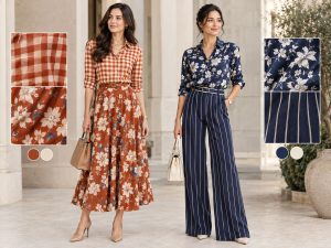
Name the colors in each print. If one color appears in both, the pairing has a foundation: a rust floral and a rust-and-cream check share rust, so a cream or tan piece next to either looks intentional.
If no color is shared outright, check temperature instead. An entirely warm print (rust, mustard, warm pink) can sit next to an entirely cool one (navy, teal, cool gray) without a shared color, provided neither carries its opposite temperature too. This is narrower than full color theory; the reasoning behind why colors pair at all, including undertone and complementary pairing, belongs to how to match colors in an outfit rather than here.
Test two: different scale, and the separate question of density
Scale is the size of the individual motif: a small ditsy floral, a medium houndstooth, a large abstract print. Two prints at the same scale compete for the same job, explained below.
Density is a different measurement, routinely confused with scale. Density is how much of the fabric’s surface a print actually covers, independent of how big each motif is.
A large floral with wide gaps of visible background is large-scale but low-density. A large floral with blooms overlapping edge to edge and no visible background is large-scale but high-density. The sparse version pairs easily with a busy second print because enough background shows through to give the eye rest on its own. The dense version needs a small-scale print or a solid piece instead.
Two prints can match in scale and clash on density, or differ in scale and still clash if both are high-density with little visible background.

Test three: somewhere for the eye to rest
Even a pairing that passes the first two tests can feel busy without a plain area anywhere in the outfit. A solid blazer, trouser, belt, bag, or shoe gives the eye a place to land.
Black does this reliably because it reads as neutral against almost any print, and the reasoning for using it as a base is in what colors go with black. A crisp solid top under printed layers works the same way, and a white button-down earns its place here because its collar and placket read as a clean line, covered on its own in how to style a white button-down shirt.

Why scale contrast actually works
An eye scanning an outfit looks for the largest, most distinct shapes first, then moves to finer detail. If two prints are close in scale, they present the same size of shape at the same time, and the eye cannot decide which to process first, which reads as visual noise.
Put a large print next to a small one and the scanning order resolves itself: the large shapes read first as the dominant pattern, the small print reads second as detail. A print dominant in area (a skirt) and one subordinate in area (a small accessory) can share similar scale without clashing, since area does the same job scale contrast does.
Stripes, dots and checks behave like neutrals
Stripes, small polka dots, and gingham or houndstooth checks are prints, but their regular, repeating structure reads closer to a solid or a texture than a floral or abstract print does. That makes them easy to mix with first, since they rarely fail test two on their own. A striped top under a floral skirt, or a gingham shirt under a paisley scarf, works more often than two florals of similar scale, because the stripe or check is already doing test two’s job.

Texture counts as a print
Cable knit, tweed, eyelet, ribbing, and boucle all read as pattern, and every test above applies to them exactly as it applies to a printed fabric.
A cable knit has a repeating raised texture that reads like a small geometric print: it has scale (the cable’s width) and density (how tightly packed the cables are). Tweed is a dense, high-frequency texture, closer to a small busy print than a solid. Eyelet has visible negative space at regular intervals and functions like a low-density print. Ribbing is the most solid-reading of the group but still carries enough texture to register as pattern.
Treating a textured piece as “basically a solid” is the most common reason a print-plus-texture outfit ends up busier than expected: a tweed jacket over a printed dress is two prints, not one print and one neutral, and needs to pass the same three tests as two woven prints would. A ribbed knit under the same dress is safer, since its low density genuinely behaves closer to a solid.

Pairings that reliably work
- A small-scale, low-density print with a large-scale print in a shared color.
- A striped or checked piece with almost any second print.
- A dense, busy print with a solid or a low-density texture like ribbing, rather than a second busy print.
- Two prints that share one strong color even when the patterns are unrelated, such as a floral and a check that both include the same navy. The near-match risk covered in wearing navy and black together applies here too: colors close but not identical can read as a mistake rather than a pairing.
Pairings that reliably do not
- Two prints at the same scale and density with no shared color: a solid piece usually cannot rescue this.
- A large, dense print with a second large, dense print, since both compete for the same dominant role.
- A heavily textured piece treated as neutral and worn with a second busy print, without checking whether the texture already reads as pattern.

The accidental print mix: linings, scarves, bags and shoes
A print can enter an outfit uninvited: a printed lining at a rolled cuff, a scarf, a printed bag, or patterned shoes can turn a one-print outfit into two. The same three tests apply; a small lining rarely needs checking, but a scarf or bag with real visual weight does.

Starting small, if two full prints feels like a lot
Two full printed garments is the highest-commitment version of this, and there is no requirement to start there. A printed scarf against a solid outfit, a printed shoe under solid trousers, or a small print paired with a texture apply the same tests at a smaller scale first.
The honest note: you do not have to mix prints
A solid-and-texture outfit, or a single print worn against solids, is a complete outfit on its own. Print mixing is one option, not a requirement. If checking color against scale and density feels like more math than a morning allows, a single print with solids, plus mixed metals or neutrals if needed (covered separately in how to mix metals in an outfit), reaches the same result with one fewer variable.
Steal these formulas
- Low-risk first pairing: thin stripe top, small-scale floral skirt in a shared color, one solid piece.
- Dense-print rescue: large, high-density print with a solid top or bottom, plus a low-density texture such as a ribbed cardigan.
- Texture as the second print: one printed piece, one cable knit or tweed layer in a shared color, no third print needed.
- Accidental mix, handled: a solid outfit with a printed scarf or bag, checked once and left alone.
- Skip the math entirely: one print, solid pieces everywhere else, one accessory for interest.

Quick answer recap
Run three tests in order: shared color, then clearly different scale or density, then a solid piece for the eye to rest on. Scale contrast works because two prints of the same size compete for the same visual job and the eye cannot resolve which to read first. Density is separate from scale: how much background shows through, and a large sparse print behaves nothing like a dense one. Texture counts as a print, needing the same tests. None of this is required.
FAQ
How do you mix prints without them clashing?
Check that the two prints share a color or sit in the same temperature family, confirm they are clearly different in scale or density, and add a solid piece for the eye to rest on. A pairing that fails one test can usually be fixed with a solid third piece.
What is the difference between print scale and print density?
Scale is the size of the individual motif; density is how much of the fabric’s surface the print covers. A large floral with visible background is large-scale but low-density, while one with overlapping blooms and no background is large-scale but high-density.
Do stripes count as a print when mixing patterns?
Yes, but their regular, repeating structure reads closer to a neutral than a floral or abstract print does, which is why stripes and checks are easy to pair with a second print.
Does a textured fabric like cable knit or tweed count as a print?
Yes. Cable knit, tweed, eyelet, ribbing, and boucle all have visible scale and density and need to pass the same three tests as a printed fabric. A tweed jacket over a printed dress is two prints, not one print and one neutral.
Is it necessary to mix prints at all?
No. A single print worn with solid pieces, or an all-solid outfit built around texture and color, is a complete outfit on its own. Print mixing is one option, not a requirement.